Some Interest(ing) Rate Data
The U.S. Treasury debt market is not only the largest and most widely tracked “commodity” market, it also provides a basis against which almost all other “rates” in the world are measured. The past decade has witnessed rate shocks of previously unexperienced magnitudes; and these have been met with newly envisioned and implemented government policy responses to both private and public sector financial market participants. What follows is a simplified depiction of the history of interest rates, to highlight periods of large movements, associated government actions, and implications for borrowing spreads for the agricultural sector. As the topics just listed could easily fill a four-year undergraduate curriculum with interesting and challenging courses, the version provided herein is cast with a nod to Hawking, as a brief history of interest rates – or the cost of time through time. It is long on pictures, and brief on details at some points, but hopefully provides an interesting presentation of interest rate markets over one of the most interesting periods in recent history.
To begin, a few stylized descriptions are provided of the particular rate data used to make the case: the Treasury Yield Curve. The yield curve simply refers to the rates at a point in time for investments of differing terms in like-risk investments. As the Treasury yield curve is regarded as credit risk-free, it is generally used to summarize the risk free (inflation included) base rate against which most other investments are then compared. The shape of the Treasury yield curve in a general sense reflects the aggregate expectations and uncertainty over future inflation, productivity growth, and myriad other economic factors. Thus, while it is a “full information” market, that information changes through time and gets resolved in changes in both the Treasury yield curve and the “spreads” over Treasuries that other investments carry. The size of an individual security’s spread in turn reflects perceptions of credit and liquidity risk embedded in the investments that are not in the Treasury analog. The spreads result in practical effects registering in things such as costs of loans, size of investments, terms (durations) of investment, and so forth that also aggregate to various levels of business activity. Monetary policy (and reserving requirements for those that view the Fed and Treasury as separate policy levers) are aimed to influence the level and shape of the yield curve to effect desired economic responses. While there is substantial debate about the effectiveness of any given policy, and even if government bonds can do anything to affect total wealth, it does at least seem clear that the nominal rate curves are sensitive to major monetary policy actions.
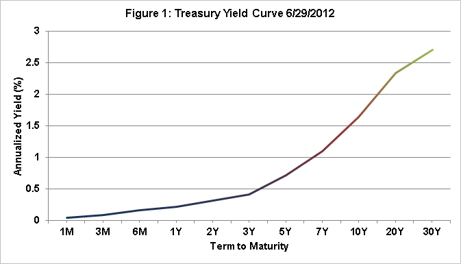
When rates at a point in time are plotted against term to maturity, that date’s Term Structure for a given type of investment emerges. Figure 1 shows the rates for Constant Maturity Treasury rates as of last Friday – the most recent week available at the time of this note. In most cases, the term structure is shown on a log scale, but the intervals chosen to graph the rates result in a generally comparable depiction. As can be seen, short term rates are under 1% out to a term of just under 7% and increase to just over 2.71% for a period of a thirty year investment made as of 6/29/12. This curve serves as the starting point against which business investment and loan decisions are anchored through funding costs and associated spreads, for example.

If nothing in the information set affecting rate expectations ever changed, the curve would be the same every day and there would be no need to change levels of business activity in response. However, if one simply plots this relationship each day, or week, or month to track historic differences, an interesting summary emerges that helps place historic events into relative context. Figure 2 simply collects the week-ending term structures (and adds some annotations on dates of possible interest). The data in the graph are from the H.15 Fed data set from January 2001 to present. Some historic event dates and periods worth noting show up in this version of the rate history as relatively more pronounced level or curve changes. If described in terms associated with mountain topography, the sharper faces and cliffs represent more rapid movements, the peaks are higher levels, and the differing inclines at given dates reflect different views of inflation and productivity potential through time.

Starting from the left side of the graph, the post “dot.com” recession and period following the 9/11 terrorist attacks included sharply lower short term interest rates. Some argue that the monetary easing that occurred was targeted at longer points on the yield curve, but that only the short end ever can be directly influenced by target fed funds rates and other exchanges of monetary aggregates (reserves and direct money supply effects). In any case, the rapid expansion that followed was accompanied with higher short term interest rates and relatively little movement in the longer term rates, though rates exceeded 5% during 2004-6 corresponding to the highest running inflation periods as well. The FOMC actions during this period may be viewed as either leading or reacting, but are at least consistent in direction and magnitude with the resulting movements at the short term end of the yield curve where steady increases in target rates were implemented from June 2004 – June 2006 (a concise summary of FOMC actions on fed funds and discount rate targets is available at: http://en.wikipedia.org/wiki/History_of_Federal_Open_Market_Committee_actions).
The yield curve was gradually approaching a more normal shape until the next significant period of change in 2007 occurred with the start of the Housing Credit Crisis. The term Credit Crisis is intentional accepted from various descriptions in the press to distinguish the response from other periods of debt crises or liquidity crises. More importantly, it also refers to the type of government response that emerged that included for the first time in any meaningful magnitude, the direct purchase of assets by the Fed in an effort to enhance the credit profile that remained on the balance sheets of major financial institutions (rather than operate solely through rates offered for lent funds). Of particular note is the “cliff wall” at September 19, 2008 – the Friday after Lehman Bros. announced bankruptcy and perhaps the date of the greatest funding uncertainty in history for many lenders. Simply put, the term debt market shut down, the spreads moved in some cases by 900 basis points in a day, and overnight borrowings were used to roll longer term debt maturities in far greater degrees than ever before. By the following Monday, it was more expected that additional liquidity facilities would be backstopped in some form by the government, but with little clear idea of the precise form. It took roughly a month to formalize the program that is now referred to as Quantitative Easing I — or QE-1 – the program under which a total of approximately $2 Trillion was added to the Federal Reserve’s balance sheet through June 2010 primarily through purchases of mortgage backed securities whose associated capital requirements for banks were increasingly viewed as untenable to maintain. In other words, the Fed was the lender of last resort and became the secondary market for loans that had declined in credit quality. Again, it is important to appreciate that there is really no other historic precedence for this type of non-money money printing, as it has been termed (an exceptional visual summary of the associated programs is available at: http://www.clevelandfed.org/research/data/credit_easing/index.cfm).
What can be seen in the graph for the ensuing several years is what I will term a liquidity “puddle” at the short end of the yield curve resulting from the exchange of longer term assets for shorter term assets also resulting in excess short term reserves. The associated short term interest rates near zero and the longer dated rates at relatively steep perspectives led to a decision to continue with a second round of quantitative easing or QE-2. Initiated in November 2010, it involved roughly $600 billion in additional authority to purchase, but in this case it is more correctly viewed as a real asset swap rather than an acceptance of lower quality credit risk with far less investment in deeply troubled securities, and generally providing even more liquidity (the liquidity puddle gets deeper in the sense of moving further out on the term axis). The scheduled round of QE-2 was to end around June 2011, but by fall 2011, there remained concern about the shape of the yield curve and the view that it was preferential to have a higher short end, and a lower long end resulted in the announcement in September of Operation Twist (or OT, or Overtime for QE, etc…). The idea was to simply buy up to $400 billion of long dated bonds back and sell an equivalent amount of short term (under three years) bonds to “twist” the yield curve around a duration between 3 years and the term of the purchased long term bonds. Just two weeks ago, the Fed announced a continuation with an additional authority for $267 billion, and a less determinant termination date in the future.
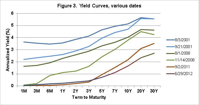
While the figures may tell interesting stories on their own, it is reasonable to ask whether the intended effects of policy, whether leading or lagging, or incidental to, in fact do show up in the rate curves and associated economic activities. Figure 3 isolates a few pairs of dates intended as rough before/after snapshots of event periods to help assess this question.
The top pair of lines compares August 2001 to late September post 9/11 when short term rates dropped dramatically, but with little impact on long term rates – a market view of a temporary interruption perhaps, or a signal that only short end yield curve effects register from monetary policies. The center pair shows the change during the summer and fall of 2008 occurring as the nature of QE-1 was becoming more evident – again with the primary effect being the reduction in short term rates. The lower pair of lines is intended to signal from the start of Operation Twist to present. The final results are not in, but what is evident is that the short end of the curve has not responded as much, likely due to the extreme liquidity and the relatively small magnitude of the short term sales (takes only $300B short term funds off banks’ balance sheets).

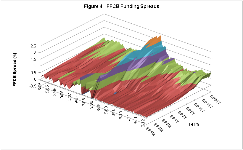
It is hoped that the data provided in the graphs represents an interesting direct view of historic interest rate data, but it is also reasonable to ask what implications there might be to agricultural markets, directly and indirectly. One directly assessable issue relates to the cost of funding loans to agricultural producers. As eluded to earlier, a firm’s borrowing cost or spread to Treasury represents both firm specific risk and macro-level uncertainty for a combined effect referred to as the Credit Spread. Though only one part of the puzzle, the Farm Credit System is able to fund at spreads to Treasury that represent a form of “agency” borrowing, and may thus serve as a partial index of the impact of changes in treasury rates on changes in the funding costs for agricultural loans. Data on funding costs by term from the Federal Farm Credit Banks Funding Corp (FFCB) were used to construct a term structure surface akin to that shown in figure 2 for Treasuries, and then the corresponding Treasury rate subtracted to leave the spread surface function. Shown in figure 4, this surface represents the additional costs of funding over Treasuries through time (monthly data are shown in contrast to earlier weekly data). What is most immediately evident is that the only meaningful historical disturbance in an otherwise fairly uniform history occurs over the height of the credit crises immediately post-Lehman bankruptcy. A natural follow-on question is to what extent the funding blip was associated with a perception of increased “own” risk or macro risk elevation and magnification of all risks relative to treasuries.

Figure 5 presents one constructed form of an answer to that question where credit spreads and share of the 10Y CMT rate are used to place the FCS credit spread in context throughout the credit crisis. In figure 5, several credit spreads are presented. The BAA-AAA spread is a measure of the difference in high quality bonds versus low investment grade bonds – or the corporate grade credit spread. The BAA-10Y CMT shows the amount of perception of credit risk through time on corporate bonds directly. SPY1 is the label on the Farm Credit System 1 year spread over treasuries for comparison. The final line is a constructed measure of the excess credit spread on FCS bonds. It is constructed as a ratio of the 10 year total credit spread on FCS bonds to the 10 year credit spread on corporate bonds to normalize for general rate level uncertainty increases. What remains is the share of the spread due to FCS only effects and again results in a remarkably stable response. This result would stand in contrast to the same effect if plotted through the early 1980s when the funding costs for FCS entities exploded over Treasuries due to perceptions of firm specific risk. This roughly constructed excess spread measure, regardless of precision, seems to highlight that it was a period of general rate stress, not a funding response specific to the farm credit system. In contrast, had similar measures been shown for the period in the early 1980s when the farm financial crisis occurred, the associated FCS credit spread would have exploded relative to Treasuries and corporate bonds signaling the perception that it was a lender specific increase in risk, not an economy wide event.

Another epilogue to the rate story is obviously that lower nominal borrowing costs have also flowed through to agricultural producers. The margins on loans have also been very healthy recently, so ag lenders have come through the crisis relatively unscathed in the large. Remaining questions include how the capitalization rate applied agricultural income that leads to asset valuation decisions is tied to future rate environment changes. That question is entwined in a story yet to be written about the Fed’s exit strategy from the current large holdings of MBS and other securities – and whether this can occur without inflationary pressures or losses of productivity if, or as the liquidity puddle “dries up” and we return to a more normal rate environment.
Note: The views expressed herein are solely the author’s opinions and do not necessarily reflect those of entities with whom professionally affiliated. All errors and omissions are the author’s alone.
Disclaimer: We request all readers, electronic media and others follow our citation guidelines when re-posting articles from farmdoc daily. Guidelines are available here. The farmdoc daily website falls under University of Illinois copyright and intellectual property rights. For a detailed statement, please see the University of Illinois Copyright Information and Policies here.


