


2016 County Cash Rents
The National Agricultural Statistical Service (NASS) – an agency of the U.S. Department of Agriculture – released average county cash rents for 2016 (see special sort from Quickstats). Illinois’ average rents are reported in this article. These county rents are used to imply average rents for different expected yields. NASS has been reporting average county rents for each year since 2008 except for 2015. Complete data for Illinois are shown in Appendix Tables.
Average Cash Rents
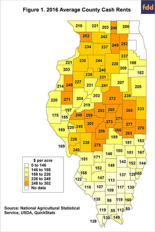
Figure 1 shows a map containing 2016 cash rents for counties in Illinois. These rents represent averages for non-irrigated cropland. A few counties do not have averages, likely because statistically reliable estimates could not be obtained from survey responses.
As can be seen in Figure 1, there is a considerable range in cash rents across Illinois. The highest cash rents tend to be located in central Illinois, with the highest cash rent of $301 per acre occurring in Sangamon County. Lower cash rents tend to be in southern Illinois, with the lowest county rent of $55 per acre occurring in Johnson County.
Much of the range in county cash rents relates to farmland productivity. To illustrate, trend yields for corn were calculated for each county in Illinois by fitting a straight line through county yields from 1972 to 2015. The 2016 trend yield is found by extending the straight line from the end of 2015 to arrive at the 2016 trend yield. A trend yield represents the expected yield for the county. If 2016 could be repeated many times, the average of the resulting yields would be close to the trend yield.
Figure 2 shows a graph relating 2016 cash rents to 2016 trend yields. Each point represents a county, with its cash rent given on the vertical axis and the trend yield given on the horizontal axis. As can be seen in Figure 2, cash rents increase as trend yields increase. The red line is fit through the trend yield – cash rent data. This line explains 78% of the variability in cash rents.

Average Cash Rents for Different Trend Yields
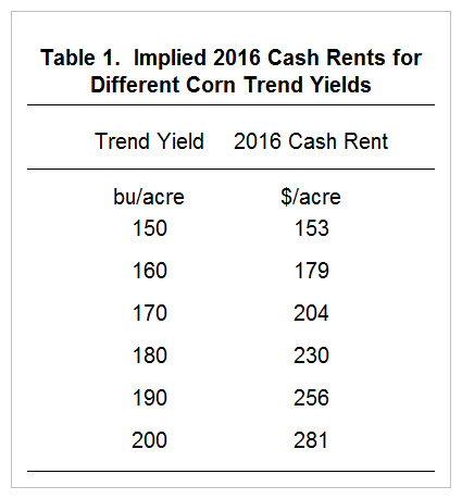
The red line can be used to imply average rents for different trend yields, as is done in Table 1. At a 200 bushels per acre yield, for example, the average cash rent is $281 per acre. Values in Table 1 can be used to see if a particular farm’s cash rent is close to the “average” for that productivity. A reasonable estimate of a farm’s trend yield is the average of the five previous yields plus a bushel or two.
There is a considerable variability around these averages. Two parcels with the same productivity next to one another could have cash rents that differ by over $100 per acre. Many factors influence cash rents, with interpersonal relations between landowners and farmers being important determinants.
Summary
Cash rents in Figures 1 and Table 1 provide benchmarks for average levels of cash rents in 2016. There is much variability around these averages. Downward pressures likely are being placed on rents. Therefore it is likely that average rents in 2017 likely will be lower than those for 2016.
Appendices

Disclaimer: We request all readers, electronic media and others follow our citation guidelines when re-posting articles from farmdoc daily. Guidelines are available here. The farmdoc daily website falls under University of Illinois copyright and intellectual property rights. For a detailed statement, please see the University of Illinois Copyright Information and Policies here.