


Farmer Demonstration Networks as a Catalyst for Conservation Adoption
Cover crop use in the US Cornbelt remains low, despite significant public and private investment in efforts to support adoption (farmdoc daily, February 22, 2024). The US Department of Agriculture alone invests $6.5 billion annually into conservation programs, many of which focus largely on support payments rather than technical support (e.g., EQIP) (USDA, 2023). A large literature on the factors that influence cover crop adoption finds that payments alone are often not successful in supporting conservation adoption, as the choice to adopt conservation is complex and personal (Deane et al., 2023; Prokopy et al., 2019). Moreover, the success of conservation in the Cornbelt goes beyond adoption and requires that producers prefer to persistently use cover crops in their system (farmdoc daily, April 24, 2025).
One major hurdle to sustained adoption is the steep learning curve that a producer faces in the first years of cover cropping (farmdoc daily, June 5, 2025). In a recent article, we studied the role of a USDA-funded demonstration farm program in cover crop adoption (Craska et al., 2025). Demonstration farms are one method to that promote peer farmer communication and learning (Sutherland and Marchand, 2021), along with participatory extension programs (Knook et al., 2018) and formal farmer networks (Pape and Prokopy, 2017). Our analysis provides the first empirical estimate of conservation adoption after a demonstration farm program, and we are the first to study cover crop adoption in a program’s entire region, including on non-participating farms. We found that cover crop adoption increased by 50% four or more years after the program was rolled out, speaking to the power of farmers as demonstration leaders and the capacity for existing networks of farmers to increase conservation adoption.
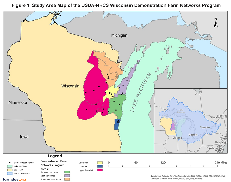
The USDA’s Natural Resources Conservation Service, through funding from the Great Lakes Restoration Initiative and in partnership with University of Wisconsin Extension and County Land and Water Conservation Departments, launched the Wisconsin Demonstration Farm Networks program in 2014 in a single watershed in Wisconsin (Lower Fox). Since then, the program has rolled out in five additional Wisconsin watersheds and spread to other states, including Indiana, New York and Ohio (see Figure 1 for a visual of network regions). At the center of the program are the Demonstration Farmers. Demo farmers trial conservation practices that have water quality benefits, host field days, and participate in program activities (e.g., roundtables). Farms that participate in the network receive additional technical support from the program conservation staff and remain eligible to receive financial assistance via EQIP.
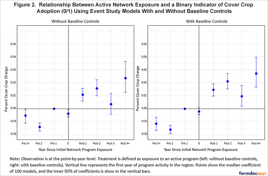
Because the program was rolled out across the study area over time, we used two-way fixed effects regression to compare cover crop adoption within a network region before and after the program as well as to compare networks regions to other network regions that had not yet begun the program. We used remote sensing estimates of cover crop use from Zhou et al. (2022). We estimated the likelihood that a random point had cover crops based on whether a point was (1) located in a network region that had already become active (i.e., the program had started) (2) whether it was close it was to a demo farm (i.e., within 5 or 10 kilometers) and (3) how many demo farms were active in that network region. Our regression controlled for other characteristics of the network region that might influence conservation adoption (e.g., soil type and geology, average farm size and income, federal payments, and the number of local conservation staff) as well as state and federal policy changes that affected the entire study region.
We found significant increases in cover crop adoption following the program’s rollout in all estimates. Adoption was 0.6 percentage points more likely in the network region as a whole, which is a 10% percent increase compared to a baseline cover crop rate in the region of only 6.3% percent. Adoption was even more likely in closer proximity to demo farms: a random point was 0.8 percentage points (13%) more likely to have cover crops if it was within 5 kilometers of a demo farm. We also found adoption increased with the number of demonstration farms in the network region. Adoption increased 0.1 percentage points (2%) with each additional farm in the region. Adoption increased over time, with a 3 percentage point (48%) increase in adoption likelihood four or more years after the network becomes active.
Our results suggest that demonstration farm networks, led by real farmers trialing practices on their working farms with support from on-the-ground conservation staff, are an effective tool to share information with conservation-curious producers. All farmers in the region remained eligible for EQIP payments, making this program an additional support for local producers. Yet the adoption we estimated far outpaced previous estimates by Park et al. (2023) of the impact of EQIP payments alone. In the study region during the period we analyzed, farmers received $10.6 million in EQIP. Per the findings of Park et al., we would expect at most a 0.06% increase in cover crop adoption due to this public spending level, which is far below the change we observe (10% on average and nearly 50% after 4 years).
Based on our results, we suggest the following for policy or program leaders seeking to increase conservation adoption and/or the cost-effectiveness of conservation programs in their region:
- Work with trusted conservation leaders and existing farmer networks as a complement to existing payment-based programs.
- Choose a program region scale that allows information-sharing between farmers. Adoption increased with density of demonstration farmers within the region.
- Allow the program time to grow. We found the largest increases four or more years after a network became active.
Acknowledgements
The research conducted in Craska, Skidmore, and Wardropper (2025) was supported by The Nature Conservancy (#116919), the National Great Rivers Research and Education Council (#115540), and USDA Hatch (#7003617).
References
Cilento, S., J. Coppess and M. Skidmore. "Mastering the Early Years: Lessons on the Cover Crop Learning Curve, Part 3." farmdoc daily (15):103, Department of Agricultural and Consumer Economics, University of Illinois at Urbana-Champaign, June 5, 2025.
Cilento, S., J. Coppess and M. Skidmore. "Missing the System for the Adoption: Lessons on the Cover Crop Learning Curve, Part 1." farmdoc daily (15):77, Department of Agricultural and Consumer Economics, University of Illinois at Urbana-Champaign, April 24, 2025.
Craska, H. D., Skidmore, M. E., & Wardropper, C. B. (2025). Farmer demonstration network program associated with increased conservation adoption. Conservation Letters, 18(6), e13164. https://doi.org/10.1111/conl.13164
Deane, F., Hamman, E., Helmstedt, K. J., Loechel, B., Jarvis, D., Mayfield, H., Stevens, L., Taylor, B., & Vella, K. (2023). Scrutinizing the impact of policy instruments on adoption of agricultural conservation practices using Bayesian expert models. Conservation Letters, 16(6), e12988. https://doi.org/10.1111/conl.12988
Knook, J., Eory, V., Brander, M., & Moran, D. (2018). Evaluation of farmer participatory extension programmes. The Journal of Agricultural Education and Extension, 24(4), 309–325. https://doi.org/10.1080/1389224X.2018.1466717
Pape, A., & Prokopy, L. S. (2017). Delivering on the potential of formal farmer networks: Insights from Indiana. Journal of Soil and Water Conservation, 72(5), 463–470.
Park, B., Rejesus, R. M., Aglasan, S., Che, Y., Hagen, S. C., & Salas, W. (2023). Payments from agricultural conservation programs and cover crop adoption. Applied Economic Perspectives and Policy, 45(2), 984–1007. https://doi.org/10.1002/aepp.13248
Prokopy, L. S., Floress, K., Arbuckle, J. G., Church, S. P., Eanes, F. R., Gao, Y., Gramig, B. M., Ranjan, P., & Singh, A. S. (2019). Adoption of agricultural conservation practices in the United States: Evidence from 35 years of quantitative literature. Journal of Soil and Water Conservation, 74(5), 520–534. https://doi.org/10.2489/jswc.74.5.520
U.S. Department of Agriculture. (2023). Conservation programs. https://www.ers.usda.gov/topics/natural-resources-environment/conservation-programs/
Sutherland, L.-A., & Marchand, F. (2021). On-farm demonstration: Enabling peer-to-peer learning. The Journal of Agricultural Education and Extension, 27(5), 573–590. https://doi.org/10.1080/1389224X.2021.1959716
Zhou, Q., Guan, K., Wang, S., Jiang, C., Huang, Y., Peng, B., Chen, Z., Wang, S., Hipple, J., Schaefer, D., Qin, Z., Stroebel, S., Coppess, J., Khanna, M., & Cai, Y. (2022). Recent rapid increase of cover crop adoption across the U.S. Midwest detected by fusing multi‐source satellite data. Geophysical Research Letters, 49(22), e2022GL100249. https://doi.org/10.1029/2022GL100249
Zulauf, C., G. Schnitkey, N. Paulson and J. Coppess. "Cover Crops and Covered Cropland, 2022 US Census of Agriculture." farmdoc daily (14):37, Department of Agricultural and Consumer Economics, University of Illinois at Urbana-Champaign, February 22, 2024.
Disclaimer: We request all readers, electronic media and others follow our citation guidelines when re-posting articles from farmdoc daily. Guidelines are available here. The farmdoc daily website falls under University of Illinois copyright and intellectual property rights. For a detailed statement, please see the University of Illinois Copyright Information and Policies here.