


An Annual Look at the Components of Management Returns for Illinois Grain Farms
In posts on December 8th and February 16th, we looked at the various factors determining persistent management return performance on Illinois grain farms over a five-year time period (2005-2009). These analyses indicated that grain farms which consistently achieved management returns in the top 25% (top quartile) of all farms had higher revenues and lower power costs, and tended to be slightly larger operations in terms of total tillable acres with a smaller percentage of cash rented acres. Differences in direct costs were not as large across performance groups, and the differences in revenues tended to be driven more by crop yield variation than price levels received.
In today?s post we take a similar approach in looking at the management return distribution for Illinois grain farms on an annual basis over the same time period. While the earlier posts identified factors (i.e. higher revenues, lower power costs) which were associated with a groups of farms that had high performance consistently over the 5-year period, today?s posts attempts to look at factors associated with farms earning high returns in any particular year. The same farm-level data set from the Illinois Farm Business Farm Management (FBFM) Association was used, with approximately 900 farms in the sample in each year. The high and low performance farm groups in the earlier posts were constant across the 5-year period; the top and bottom quartiles in today?s post can and do include different individual farm operations in each year.
Figure 1 shows the average management returns for the top quartile (blue), bottom quartile (green), and all farms (red) from 2005 to 2009. The years chosen include two years of large average management returns (2007 and 2008), and three years of moderate to low average management returns (2005, 2006, and 2009). The difference in average management returns for farms in the top and bottom 25% increased from approximately $180 in 2005 to more than $280 in 2008 and 2009, illustrating a general increase in return variability over time. While the average level of returns fell in 2009, the variation in returns stayed comparable to that of the variation in the higher average return years of 2007 and 2008.

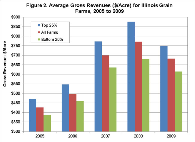
Figure 2 shows average gross revenues ($/acre) for the same farm groupings from 2005 to 2009. The largest difference in average revenues between the top and bottom quartiles was nearly $200 in 2008, with the smallest difference being around $85 in both 2005 and 2006. The difference in average revenues between the top and bottom quartiles tends to be proportional to the average level of marginal returns (larger differences when average returns are higher and vice versa). The difference in revenues between the groups accounts for anywhere from 45% (in 2006) to 68% (in 2008) of the difference in average returns between the top and bottom quartiles, making revenues the biggest factor in explaining the gap between average returns for the top and bottom quartiles.
Figures 3 and 4 show average direct and power costs ($/acre). The difference in average direct costs between the top and bottom return quartiles ranges from $11/acre in 2007 to more than $30/acre in 2009. While the levels are steadily increasing, the difference in direct costs across the farm groups is fairly stable from 2005 to 2008, with a large increase in 2009. The difference in average directs costs accounted for 5% to 8% of the difference in average management returns from 2005 to 2008, but increased to 12% in 2009. The difference in average power costs across the top and bottom quartiles ranged from about $23/acre in 2005 to almost $39/acre in 2009. The gap in average power costs accounts for 9% (in 2008) to 17% (in 2006) of the difference in average management returns achieved by the top and bottom quartiles. Both the levels and variation of average power costs trended up over this time period, with the variation in average power costs also accounting for a larger percentage of the difference in average management returns over time.


Finally, figures 5 and 6 look at the differences in farm size (total tillable acres) and tenure positions (% acres cash rented) across farms in the top and bottom quartiles for returns each year. The pattern in farms sizes is fairly stable over time, with farms in the top quartile for returns having an average farm size of 300 to 400 acres more than farms in the bottom quartile for returns. The differences in tenure positions across the top and bottom quartiles each year is also fairly stable. While the percentage of acres cash rented is trending up for all grain farms, operations in the bottom quartile of returns tend to cash rent 6% to 10% more of their total acreage than top quartile farms.


Summary
This post looked at the differences in average management returns between Illinois grain farms in the top and bottom quartiles for returns each year from 2005 to 2009. This analysis differs from previous posts (here and here) on farm return persistence in that it focuses on the determinants of annual performance rather than consistent return performance over time. Thus, farms captured in the top and bottom quartiles can change from year to year. The purpose of the annual look was to compare the factors affecting annual return performance to those affecting consistent return performance over time.
Direct and power costs for farms in the bottom return quartile are consistently greater than those for farms in the top return quartile. While direct costs have consistently increased for all farms, the differences in direct costs across farm groups in any given year were fairly stable from 2005 to 2008, with an increase in variation in 2009. The differences in power costs have trended up both in terms of the average level of the difference and the percentage of the differences in average management returns that power cost variation accounts for in any given year. Top quartile farms tend to be larger in terms of total tillable acreage and, while the general trend is towards more land being operated under cash rent agreements, farms earning returns in the top quartile each year tend to rent a smaller percentage of acreage using cash rent agreements compared to their peers. These differences in land-related factors are consistent and fairly stable during the 2005 to 2009 period.
Differences in the average gross revenues of the top and bottom quartiles consistently accounts for the biggest component of the difference in management returns (45% to 68%), with the magnitude or size of the revenue variation being proportional to the level of average management returns in a given year. In years with higher management returns on average (i.e. 2007 and 2008), the variation in average revenues across farms in the top and bottom quartiles is also larger. In a future post on this topic I will provide a closer look at this gap in gross revenues across farms in the top and bottom 25% for farm returns each year, breaking the difference down into yield and price effects.
Disclaimer: We request all readers, electronic media and others follow our citation guidelines when re-posting articles from farmdoc daily. Guidelines are available here. The farmdoc daily website falls under University of Illinois copyright and intellectual property rights. For a detailed statement, please see the University of Illinois Copyright Information and Policies here.