


Farmland Markets – Comparing the 1980s and the Present
There has been a recent increase in the number of inquiries received asking about the current farmland market, and potential parallels to the early 1980s; and about precursor indicators of the farmland value declines in what is often termed the farmland crisis of the 1980s. This line of questions is not new as there have been suggestions about the potential for a farmland bubble from notable commentators and in sponsored events for several years now.[1] In particular, technical comparisons and apparent pattern similarities have been highlighted and used as warnings for the potential for a farmland bubble, while the market for farmland has remained strong.
The purpose of this post is to simply provide summary empirical data on several selected factors that likely relate to farmland market conditions, and to also provide some brief discussion about a few other similarities and differences between the 1980s and the present. Unlike traditional research studies, the intent is not to test a proposition or hypothesis, nor form a structural model to explain current or past prices. Instead, it is simply to provide a “story in pictures” about farmland markets to help the reader reach their own conclusion about whether the farmland market “makes sense”.
Among the most important differences between the period leading up to the farm crisis of the 1980s and today are the radically different interest rate and lending environments. Figure 1 shows the average new farm mortgage interest rate from the quarterly AgLetter Survey conducted by Federal Reserve of Chicago, along with the 10-year constant Maturity Treasury interest rate. In the 1980s, farm mortgage rates peaked at nearly 17.5% and have generally declined through time in concert with mid-term treasury rates to their present levels. The “spread over treasuries” provides one indicator of the perceived risk cost and spread over funding costs. In the data shown, the farm mortgage spreads averaged just over 2.25% for most of the period after the crisis of the 1980s, which is a higher level than during the pre-crisis era.

Importantly, the level of indebtedness has also been reduced through time, rendering the sector as a whole less vulnerable to collateral revaluations. As shown in figure 2 below, the sector has very low aggregate leverage (for context, NYSE traded companies in aggregate average around 65% debt). An implication is that there is more of a “buffer” built into the current holdings compared to that in the 1980s for asset re-valuations to trigger sell-off or liquidation responses from nearing zero equity.
In addition, typical mortgage loans in the 1980s included longer amortization periods (up to 40 years in some cases) and higher loan-to-value fractions than is typical today. Two important implications include that the principal reduction occurs more slowly in longer length loans, and that the fraction of the asset value in the form of current income required to service the debt was also much higher in the crisis period than is the case today.

Next, it is well-accepted that asset values reflect market participants’ expectations regarding income levels and riskiness of income. In the case of farm real estate, there have been several recent years with higher than historic average income, and thus the attendant questions about the ability to continue to generate the same levels. Figure 3 below helps place that question into context. It is noted that these aggregate values may not represent individual farm cases well, but the point is that recent USDA forecasts of income have been reported in some cases as simply “reductions in income”. While true relative to recent few years, it is also true that the reductions are to levels that are above the historical averages in constant 2014 dollars. Whether this level matches well with market participants’ views of income is also debatable, but the general pattern of income through time remains important to appreciate, whatever the cause and potential effect.

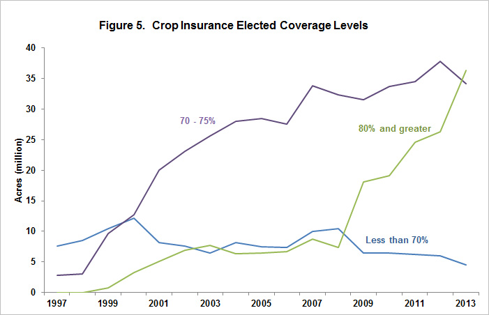
Another feature sometimes underappreciated in making comparisons to the 1980s is the dramatically different nature of crop insurance and the degree to which its use can reduce income variability and shortfalls in poor production years. Figures 4 and 5 below help to better understand the role of crop insurance and its use to protect expected revenue. Figure 4 shows the acres of corn insured through time from 1989 to present. Importantly, the modern crop insurance programs expanded to include revenue coverage later in the period – a product that did not exist in the 1980s when only rudimentary version of APH yield insurance existed, and only at low coverage levels. Figure 5 completes the story showing the increase in average coverage levels that occurred through time as well. The impacts of these accrue in various ways, but perhaps can be summarized in the experience of 2012 when the corn and soybean crop suffered enormous drought damage, yet incomes remained high and there were also no major calls for ad hoc disaster relief as a result of the effects of insurance coverage. Another meaningful interpretation is that the modern insurance programs allow a producer to put a floor under losses, and also to very reliably address risks associated with cash rents of farmland (an analog of income to the asset).

Finally, figure 6 combines information from related income and interest rate series to create an implied capitalization rate by dividing the income by the value of the asset that generated the income – a commonly used related presentation of capitalized values has been presented in various forms in prior FDD posts and numerous prior presentations (e.g. http://farmland.illinois.edu/). This graph shows the case of Illinois as an example, and is remarkably similar when examined for most production regions in the US.
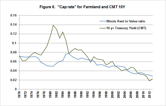
The one obvious departure occurs in the period leading to the crisis, but is absent in general in recent periods. This presentation of the capitalization rate does not say anything directly about asset values except that the multiple willing to be paid for the income seems to be in line with that implied by other rational valuation principles.
In summary, there are substantial risks facing agriculture and the markets for assets used in agricultural production, as has always been the case. To understand these, it is also important to also have a clear sense of the factors associated with the fundamental drivers in the market. Income expectations remain reasonable and fairly stable, debt rates are low and interest rates are also historically low providing a buffer against potential asset revaluations, and crop insurance has fundamentally altered the riskiness of income as intended. There can still be important adjustments in any market as individuals refine and adjust their understanding of the factors influencing future income potential, but hopefully this “story in pictures” adds to the accuracy of the understanding of agricultural farmland markets.
Note: The views expressed herein are solely the authors’ opinions and do not necessarily reflect those of entities with whom professionally affiliated. As always, we welcome comments, suggestions, and questions that might be usefully addressed in future postings.
This line of inquiry has been particularly improved by conversations and helpful communications with individuals involved in the Global Ag Investing Conference, members of the Real Assets group at TIAA, David Oppedahl at the Chicago Federal Reserve, Jackson Takach at FAMC, and Todd Kuethe at the University of Illinois among others. All errors and omissions are the authors’ alone.
References
[1] Among the prior references to the potential for a farmland bubble, Robert Shiller referred to the farmland as the "dark horse" for the next bubble (2011), FDIC hosted a conference titled "Don't Bet the Farm" investigating farmland pricing and the potential for a farmland bubble (2011), and AEI's Alec Pollack has made comparisons between the farmland price patterns and the housing crash patterns preceding the financial crisis (2012).
Disclaimer: We request all readers, electronic media and others follow our citation guidelines when re-posting articles from farmdoc daily. Guidelines are available here. The farmdoc daily website falls under University of Illinois copyright and intellectual property rights. For a detailed statement, please see the University of Illinois Copyright Information and Policies here.