


Estimating the Biodiesel Supply Curve
In a post on September 25th, the relationship between the profitability of biodiesel production and the quantity of biodiesel produced was examined. It was noted in the post that the responsiveness of biodiesel supply to profits plays a key role in determining the price of D4 biodiesel RINs, and in some circumstances, D6 ethanol RINs (see the posts here and here for detailed explanations). The purpose of today’s post is to derive the biodiesel supply curve from the relationships first presented in the September 25th post.
We begin by reviewing the main results of that earlier post. Figure 1 shows a scatter of monthly biodiesel production and net returns above variable costs for each calendar year between 2010 and 2013. Monthly biodiesel production is estimated by the EIA and monthly biodiesel net production returns above variable costs are based on a model of a representative Iowa biodiesel plant (see the post here). A best-fit regression line is also shown for each year, with the natural log (ln) of production used as the dependent variable. The data are divided by calendar years because in years when the blenders tax credit is not in place (2010 and 2012) there is little relationship between biodiesel production and returns. Basically, production in these years is “stuck” at the RFS biodiesel mandate regardless of the level of returns. In the other years (2011 and 2013) market participants expect the credit to expire at the end of a calendar year, so there there is an obvious incentive for blenders to bid up the price of biodiesel in order to increase production and take full advantage of the credit before it expires. In essence, the unusual market circumstances in 2011 and 2013 provide a unique opportunity to identify a biodiesel supply curve even with a seemingly binding RFS mandate in place.

Since 2013 provides the most recent observations on biodiesel production response, and the response is larger than in 2011, it is argued here that the 2013 observations provide the best data available for estimating the short-run supply curve for biodiesel. Based on that assumption, the next step in the analysis is to make the following conversions of the data for 2013: i) flip the y- and x-axes; and ii) convert monthly quantities to annual quantities by multiplying monthly quantities by 12. The results of these changes are shown in Figure 2. Note that there is no difference between the estimated curves for 2013 in Figures 1 and 2 except the previously mentioned changes. In order to keep the same shape, however, an exponential (exp) function of quantity is used in Figure 2. The final step is to plot the curve in terms of price on the y-axis instead of net returns. This is accomplished by adding back to net returns all variable costs, including soybean oil, natural gas, and methanol costs, and subtracting glycerin revenue. The average price per unit of these inputs for January – August 2013 is used in this step. The resulting supply curve for biodiesel is shown in Figure 3. Again, note that the only difference between the curve in Figure 3 compared to that in Figure 2 is the re-scaling of the y-axis.


The estimated supply curve for biodiesel in Figure 3 has several interesting characteristics. First, the slope of the curve increases as production increases, and in particular, relatively large price changes are required to move production above 2 billion gallons. This is consistent with recent EIA estimates that the current annual production capacity of biodiesel plants in the U.S. is about 2.2 billion gallons. Second, the curve can be used to compute the elasticity of supply, which is simply the percent change in production for a one-percent change in price, all else held constant. The elasticity changes at each point along the curve for this functional form, so two examples are provided. At a production level of 1 billion gallons, the elasticity of supply is 8, implying that a 1 percent increase in price prompts an 8 percent increase in production. At a production level of 2 billion gallons, the elasticity of supply drops to 1.5, implying that a 1 percent increase in price results in only a 1.5 percent increase in production. The declining elasticity of supply as production increases makes sense since less and less excess capacity is available. Readers may also recall that much smaller production elasticities were reported in the September 25th post. This simply reflects the fact that a given cents per gallon increase in net returns is a much larger percentage increase relative to net returns as compared to price. Third, the supply curve will shift if any of the variables held constant (price of soybean oil, natural gas, methanol, and glycerin) is allowed to change. By far the most important of these variables is the price of soybean oil since soybean oil feedstock costs represent over 80 percent of the total variable costs of biodiesel production for the type of plants assumed in this analysis. Figure 4 shows how the supply curve shifts for different levels of soybean oil prices. The middle curve assumes a soybean oil price of $0.47/lb., the average over January – August 2013, while the other two curves assume prices $0.06 higher or lower. The lower prices are near levels currently prevailing in the market.

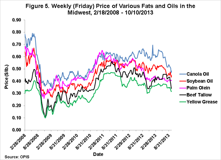
When considering the estimated supply curves presented in Figures 3 and 4, it is important to recognize that a wide range of feedstock is actually used to produce biodiesel in the U.S. Since the curves were estimated using data for only one feedstock–soybean oil–this potentially introduces error into the estimates. Fortunately, there are two reasons this is not likely to be a serious problem. First, soybean oil is by far the most widely-used feedstock for biodiesel production in the U.S., around 55-60 percent according to the EIA. Second, prices for the fats and oils used as biodiesel feedstock tend to be highly correlated, as illustrated in Figure 5. The correlation implies that variation in the relative prices of the various fats and oils prices will only have a minimal impact on supply relationships. In essence, soybean oil can be viewed as an “index” for the price of all fats and oils used as feedstock in biodiesel production. As a final point, it is also important to keep in mind that the supply curves in Figures 3 and 4 are for domestic production only and do not account for imports.
Implications
Biodiesel production is responsive to market prices as predicted by economic theory. The supply curve estimated here shows that the responsiveness declines rapidly as the level of biodiesel production increases, likely reflecting capacity limits. The biodiesel supply curve plays a key role in setting the entire structure of prices for the tradable RINs credits used to comply with RFS mandates under a binding E10 blendwall. We will examine how well the prices of RINs traded in the marketplace can be replicated using the estimated supply curve in a post next week.
Disclaimer: We request all readers, electronic media and others follow our citation guidelines when re-posting articles from farmdoc daily. Guidelines are available here. The farmdoc daily website falls under University of Illinois copyright and intellectual property rights. For a detailed statement, please see the University of Illinois Copyright Information and Policies here.