


Once Again Through the Payments Lens; Another Update from the Policy Design Lab
Recent updates to the Policy Design Lab add interactive map visualizations at the county level for Farm Bill Title I payments (ten-year totals, 2014 to 2023). Included are total payments by the commodities programs in Subtitle A (ARC and PLC), Dairy Margin Coverage, and the Supplemental Agricultural Disaster Assistance Payments. Users can select each category to visualize total payments by county. The updated visualizations are available as Figure 1 and on the website (Policy Design Lab, “Total Commodities Programs (Title I)”). The updates also include the ability to download the data, which facilitates more comparisons and analysis, as discussed below.
The maps and downloadable data offer a magnifying lens on federal farm policy and politics.
Out of a total of 3,154 total counties in the dataset, 3,047 (97%) have received at least some payments from 2014 to 2023. Clear in the map is the concentration of payments in pockets of counties in specific areas of the country. Only 24 counties (0.76%), for example, have received over $100 million in payments, while 197 counties (6%) have received over $50 million. The discussion that follows will narrow the focus to ARC and PLC payments, using the maps as a backdrop adding three perspectives from the downloadable data.
First, Table 1 presents the top 25 counties in terms of total ARC and PLC payments from 2014 to 2023. It includes the total base acres enrolled in the programs, using an average of base acres enrolled from 2019 to 2023. These years are used for base acres due primarily to the addition of seed cotton base in 2018, as well as some challenges with the data that future updates will seek to address. Except for adding seed cotton, base acres would not be expected to change much from year to year, making these four years suitable for reviewing the policies. Finally, because payments are made on the decoupled base acres each year that they are triggered, dividing the total payments by the average base acres provides a useful measure of the general value of the programs in the county.
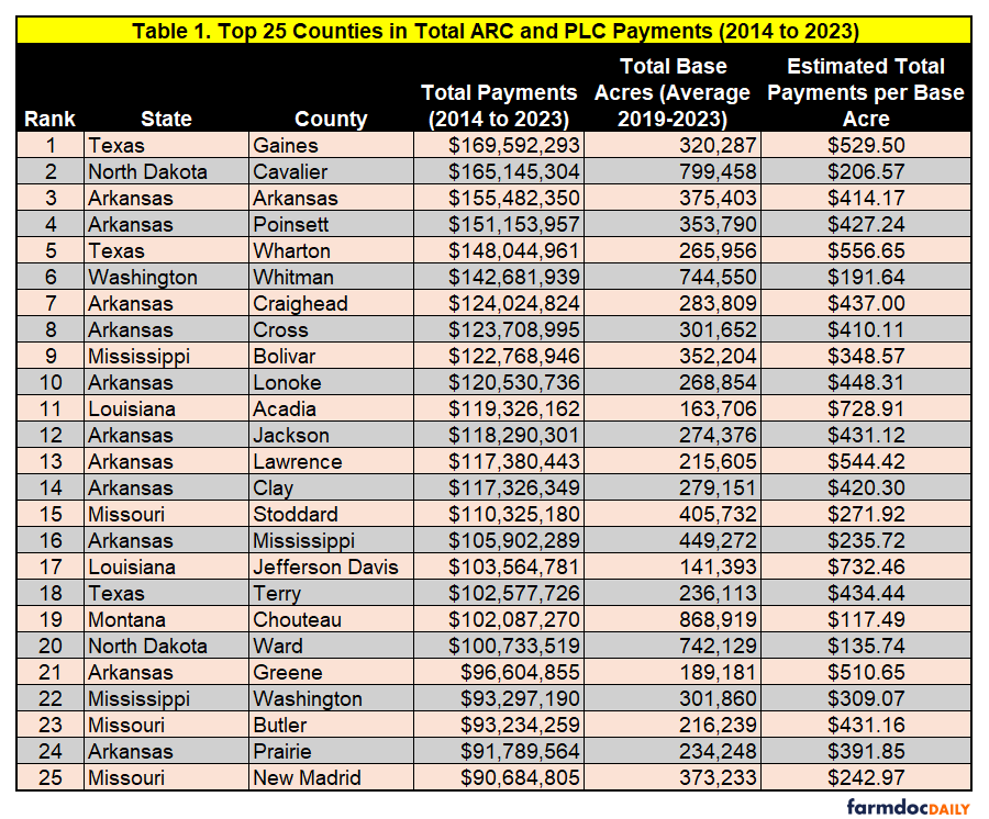
Regional dynamics dominate, direct and define payments to farmers. Southern counties make up 18 out of the top 25 counties (72%) and have much higher average payments per base acre. The importance of these differences is the fact that a farmer can plant other crops on the base acres (especially corn and soybeans), adding the payments from the programs to the revenue of the crop planted. When that happens, farmers producing and marketing the same crops can receive very different incomes because of the choices in federal payment policy design (farmdoc daily, January 29, 2026; February 12, 2026).
Table 2 presents the top 25 counties by total base acres enrolled in ARC and PLC, averaged for the years 2019 to 2023. Again, these years are used in part because of the addition of seed cotton in 2018. The table includes an average payments per base acre as in Table 1.
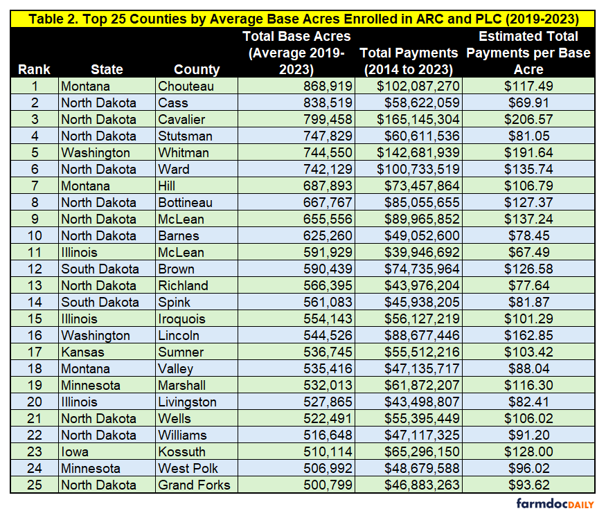
Keeping track of the regional dynamics that consume and complicate farm policy, none of the top 25 counties in terms of base acres are in the South and the value of the base acres is also notably lower. Among other things, comparing the two tables is a reminder that analyzing and understanding these programs cannot be simply a matter of total payments received; made on base acres, the number of those base acres is critical information.
Table 3 digs deeper to compare payments for ARC-CO and PLC in the top 25 counties for each program. Added to this table are the average number of payees compiled from the Farm Service Agency payment files (USDA-FSA, “Payment Files Information”). Based on counting each unique payee listed and averaging across all ten years, including years with no recipients or payments, the column represents an estimate of the number of farmers receiving payments in the county.
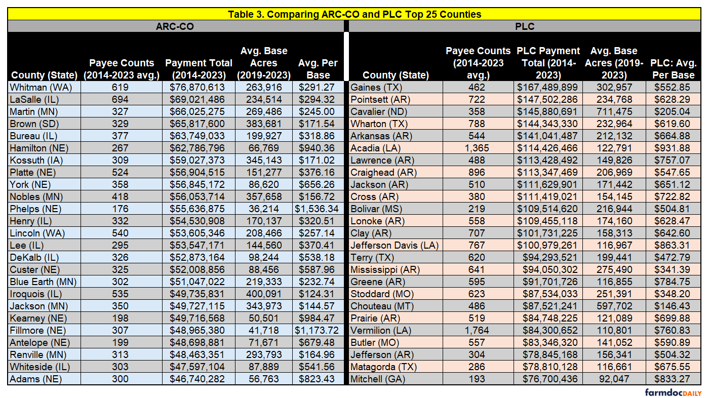
Based on the data in Table 3, PLC makes much higher payments per base acre than ARC-CO (except for a few counties in Nebraska). The regional dynamics appear again as 21 out of the top 25 PLC counties are in the South, while 23 of the top 25 ARC-CO payment counties are in the Midwest, but none in the South. Additionally, more than half of the top 25 PLC counties received more than $100 million in total payments from 2014 to 2023, but none of the top 25 ARC-CO payment counties were above that level.
Note that all payments are reported as the totals for ten crop years but there were no PLC payments for 2022 and almost no payments for 2023, while ARC-CO made minimal payments for 2020 and 2021. These payments are also in addition to the ad hoc and supplemental payments appropriated by Congress or initiated by USDA, which in some years dwarfed ARC and PLC payments and went to the same farmers, presumably concentrated in the same counties. Finally, these payments are in addition to the net benefits from crop insurance discussed previously (farmdoc daily, March 26, 2026), as well as from conservation programs; ARC and PLC are not the only source of federal assistance provided to farmers.
Gaines County, Texas provides a case study. The county was the largest recipient of total ARC and PLC payments ($169.6 million), mostly from PLC ($167.5 million). It was also the largest recipient of net farmer benefits from crop insurance for 2014 to 2024 ($795 million), with a total loss ratio of 1.79 for those years. Between ARC/PLC and crop insurance, Gaines County has received nearly $1 billion in taxpayer funded benefits for farmers; if the payee counts are an accurate representation, those total benefits went to fewer than 600 farmers. It is also important that this level of federal funding is concentrated in an area with consistently high crop losses. To put it simply, these are not indicators of good health.
Combined, the visualizations and data present a picture of farm policy since the major revisions enacted in the 2014 Farm Bill and before the troubling changes enacted last year in the Reconciliation Farm Bill. Such largesse for so few raises many difficult questions for farm policy, as do the persistent imbalances and disparities revealed by each slice of the data. Those questions are pieces of a bigger picture about political power and how it operates in policy. For example, it seems self-evident to note that money and political power go hand-in-hand, with power able to deliver money and protect its delivery, and money able to buy power. The key to both is concentration.
Political power is a much more difficult and complex topic. It is abstract and often operates in obscurity. Moreover, political power and assistance policy are also full of paradox; what helps, may also hurt, and policies designed to protect may end up causing unintended damages or consequences. Payments and benefits can have a warping effect and be distorting. When they become the priority, attention is focused on capturing the benefits—which can be seen in advice to not leave any federal dollar on the table—deploying political power to accomplish that capture and increase it. This, in turn, can stifle innovation and put up barriers to adaptation or adjustment in the real world because too much energy and too many resources are narrowed to the political game of benefit capture, locking farmers into systems where they manage federal assistance and not farm realities, risks or challenges. Examples are not difficult to find, such as whether fertilizer costs are a management problem requiring adjustments and adaptations, or something with which to bait the hook for more payments (Farm Policy News, April 15, 2026; Parum, April 14, 2026). More payments can feed the cycle of problems—it isn’t too hard to imagine sophisticated multinational fertilizer corporations factoring payments into pricing strategies—and make matters worse. Farm policy can provide a useful lens through which to better see and understand these abstract and obscure matters. Of course, such a lens helps only if it is used; a discussion to be continued.
References
Coppess, J. "Another Round of Crop Insurance; Update from the Policy Design Lab." farmdoc daily (16):51, Department of Agricultural and Consumer Economics, University of Illinois at Urbana-Champaign, March 26, 2026.
Coppess, J. "Off-Base, Part 3: Picking Winners & Losers with Policy." farmdoc daily (16):13, Department of Agricultural and Consumer Economics, University of Illinois at Urbana-Champaign, January 29, 2026.
Coppess, J. "Off-Base, Part 4: A Fundamental Flaw in the Policy." farmdoc daily (16):22, Department of Agricultural and Consumer Economics, University of Illinois at Urbana-Champaign, February 12, 2026.
Hanrahan, R. “70% of Farmers Can’t Afford All Needed Fertilizer, Survey Shows.” Farm Policy News. Department of Agricultural and Consumer Economics, University of Illinois at Urbana-Champaign, February 12, 2026. https://farmpolicynews.illinois.edu/2026/04/70-of-farmers-cant-afford-all-needed-fertilizer-survey-shows/.
Parum, Faith. “Farm Bureau Survey Reveals Real Impact of Fertilizer Availability and Price.” American Farm Bureau Federation, Market Intel. April 14, 2026. https://www.fb.org/market-intel/farm-bureau-survey-reveals-real-impact-of-fertilizer-availability-and-price.
Disclaimer: We request all readers, electronic media and others follow our citation guidelines when re-posting articles from farmdoc daily. Guidelines are available here. The farmdoc daily website falls under University of Illinois copyright and intellectual property rights. For a detailed statement, please see the University of Illinois Copyright Information and Policies here.